76 world-class designs you can use as your starting point
We curated 76 design systems from brands like Linear, Stripe, Tesla, Airbnb, and Nike. Browse the gallery, pick a look, and build your site to match — no design skills needed.
Your website's design shouldn't start from a blank page. We curated 76 design systems from the best-looking sites on the internet — and you can use any of them as your starting point.
Head to the designs gallery and browse. Each design is a complete visual language — colours, typography, spacing, layout patterns — extracted from a real-world site that millions of people already know and trust.
Pick one. Preview it. Tell your Clawfront builder "use the Stripe design" or "use the Tesla design" — and your site gets built to match.
What's in the gallery
76 designs across 12 categories, covering everything from developer tools to luxury automotive. Here's a taste of what you'll find:
Productivity & SaaS
Linear's ultra-minimal precision. Notion's warm serif elegance. Cal.com's clean developer simplicity. Zapier's friendly orange warmth. Intercom's conversational blue. Resend's dark monospace minimalism. Mintlify's reading-optimised green.
Design & Creative Tools
Figma's vibrant playfulness. Framer's bold, motion-first aesthetic. Webflow's polished marketing look. Miro's bright yellow energy. Airtable's colourful data aesthetic. Clay's organic, art-directed softness.
E-commerce & Retail
Airbnb's warm coral, photography-first layout. Nike's massive monochrome punch. Shopify's cinematic dark-first neon. Meta's clean product showcase.
Media & Consumer Tech
Apple's premium white-space perfection. Spotify's vibrant green-on-dark energy. Uber's bold urban aesthetic. SpaceX's stark, futuristic minimalism. NVIDIA's green-black power. Pinterest's image-first masonry. PlayStation's quiet-authority display. The Verge's acid-mint editorial edge. WIRED's broadsheet density.
Automotive
Tesla's radical subtraction — near-zero UI, full-viewport photography. BMW's dark German precision. Ferrari's chiaroscuro drama. Lamborghini's gold-on-black theatre. Bugatti's cinema-black austerity. Renault's vibrant aurora energy.
Fintech & Crypto
Stripe's signature purple gradients and weight-300 elegance. Revolut's sleek dark fintech. Wise's bright green clarity. Coinbase's institutional blue. Binance's bold yellow urgency. Kraken's purple-accented data density.
AI & LLM Platforms
Claude's warm terracotta editorial layout. Mistral AI's French-engineered purple minimalism. ElevenLabs' cinematic audio aesthetic. Cursor's sleek dark gradient. Replicate's clean, code-forward canvas. Cohere's vibrant data dashboards. Ollama's terminal-first simplicity. OpenCode AI's developer dark theme. RunwayML's cinematic media layout. Together AI's blueprint-style design. VoltAgent's emerald terminal aesthetic. xAI's stark futurism.
Developer Tools & IDEs
Vercel's black-and-white Geist precision. Raycast's dark chrome with vibrant gradients. Warp's modern terminal UI. Expo's code-centric dark theme. Superhuman's premium keyboard-first purple glow. Lovable's playful dev aesthetic.
Backend, Database & DevOps
Supabase's dark emerald, code-first look. MongoDB's green leaf developer docs. Sentry's data-dense pink-purple dashboards. PostHog's playful hedgehog branding. HashiCorp's enterprise-clean monochrome. ClickHouse's yellow-accented technical docs. Sanity's red-accented editorial focus. Composio's colourful integration aesthetic.
Powered by getdesign.md
These design systems are made possible by getdesign.md — an open-source project that extracts design tokens and patterns from real-world websites into portable, reusable design specs. The collection is maintained by the community via the awesome-design-md repository.
We pull from this upstream source and generate full HTML previews for each design — so you can see exactly what your site will look like before you commit to a direction.
How it works
- Browse — Open the designs gallery and scroll through every option, or search for a specific brand or style.
- Preview — Tap any design to see a full-page preview. Toggle between light and dark mode to see both variants.
- Build — Tell your Clawfront builder which design to use. That's it — your site gets built with that design language as its foundation.
Sites built with these designs
Here's a real Clawfront site that started from a design in the gallery:
Apartment 16 on Bree — built with the Airbnb design
A luxury apartment listing in Cape Town's city centre. The owner picked the Airbnb design — warm coral accents, photography-first layout, rounded UI — and had a full property site live in minutes. Hero imagery, amenity grid, gallery, location section, and contact form — all matching Airbnb's visual language.
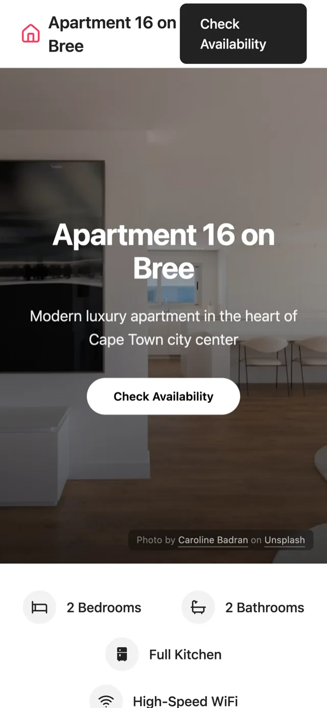
Built with the Airbnb design
Why starting from a real design matters
Design is the part where most people stall. You know what your business does. You know what to say. But making it look right? That's where the blank-page paralysis sets in.
Starting from a proven design system — one that's been refined by a world-class design team, used by millions of people, and tested across every screen size — means you skip all of that. You're not copying anyone's brand. You're borrowing their visual language: their approach to whitespace, colour, typography, and layout.
The result is a site that looks intentional from day one — not like a template, not like a default theme, but like something that was designed on purpose.
Build your own
Don't see what you're looking for? You're not limited to the gallery. Describe your own design from scratch — or pick any design above as a starting point and tell your builder what to change. The gallery is a launchpad, not a constraint.
Browse the gallery
Head to the designs gallery and find the look that fits your business. Pick a design. Build to match.
Ready to get your business online?
One WhatsApp message. Professional website. Live in 5 minutes.
Start on WhatsAppFree to try · No credit card · Live in 5 minutes